WordPress table cut off on mobile? Fix the width without losing details
Find out why a comparison table runs off the phone screen, then choose between simpler content, better wrapping and a scroll area that keeps every detail reachable.
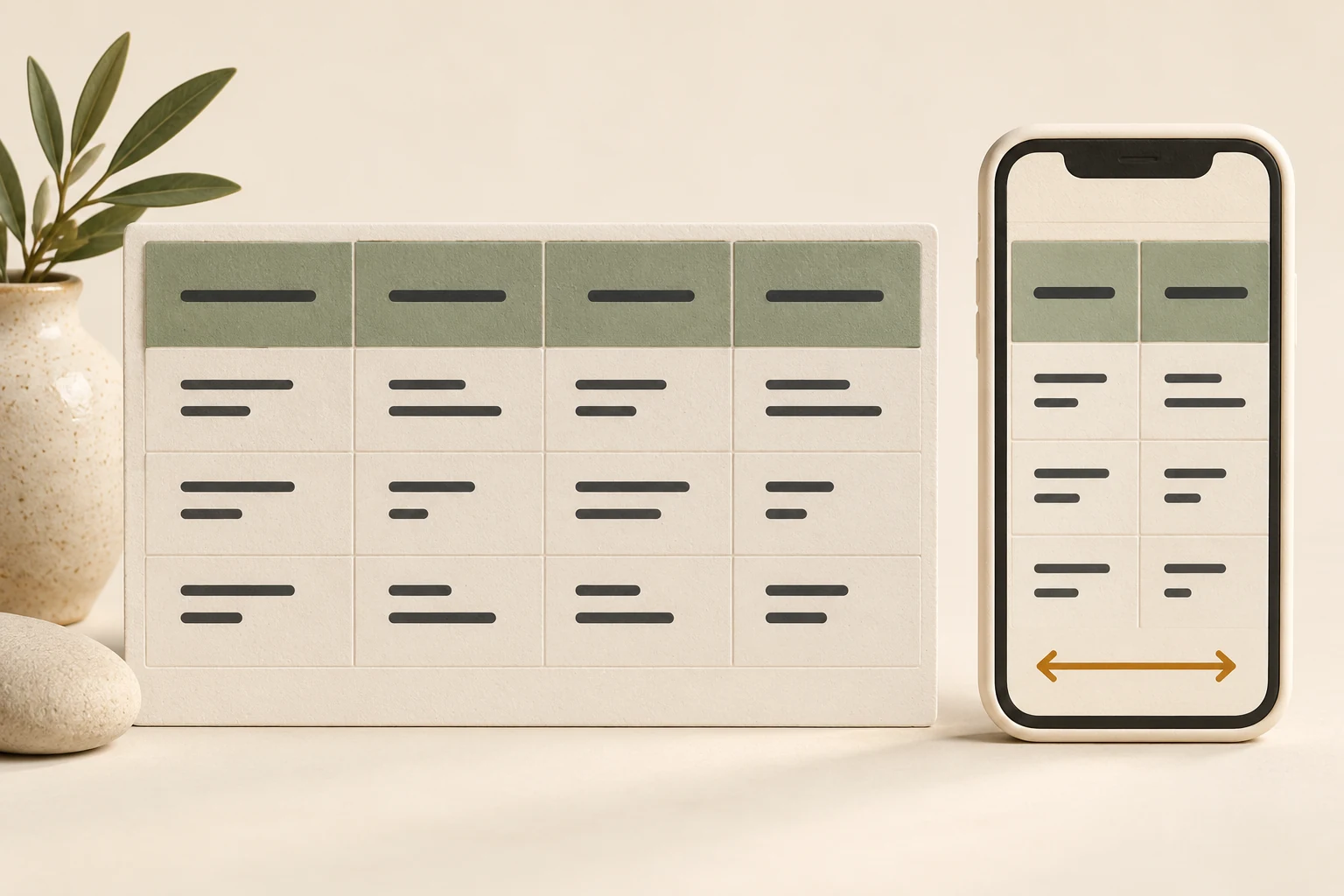
If a WordPress table is cut off on mobile, first check whether the whole page moves sideways or only the table needs more room. Long cell text, fixed widths and too many comparison columns can each cause the problem. The right fix keeps the information readable and reachable, including the last column.
Consider a fictional home-organizing business in Columbus, Ohio. Its service table compares a single-room visit, a home-office session and help with moving in. On a laptop, everything looks fine. On a phone, the final package disappears beyond the right edge. Shrinking all the text would make the table fit, but customers would struggle to compare what each visit includes.
Find what is actually too wide
Open the public page while logged out and drag sideways near the table, then near an ordinary paragraph. If the heading and paragraphs move too, the page itself is overflowing. If they stay in place while the table moves within its own box, a local scroll area may already be working.
| What you see | What to inspect first |
|---|---|
| The entire page slides sideways | The table width and the width of its surrounding block. |
| One cell stretches an otherwise small table | A long link, unbroken text or a rule preventing wrapping. |
| The last column disappears and cannot be reached | A parent container that clips content without offering a usable scroll area. |
Save a screenshot and note the phone, browser and page URL. In the editor, identify whether the content comes from the core Table block, a table plugin, a page builder or pasted HTML. A shortcode may display a table whose rows are stored elsewhere; changing the page around that shortcode will not change its column settings.
Check the WordPress Table block settings
For a core Table block, select the table and open its block settings. WordPress documents the relevant controls in its Table block guide:
- Review Fixed width table cells. Turning it on gives columns equal widths. Turning it off lets their content influence the widths. Compare both in a preview; neither setting guarantees that a large table will fit a phone.
- Enable the Header section when the first row names the columns. Making an ordinary row bold does not give it the same structure.
- Check alignment and spacing. Wide and full-width alignment depend on theme support. Extra cell padding can also leave less room for words.
Keep a copy before changing the table. Preview the saved result at a narrow width and on desktop. If a builder or plugin owns the table, use its corresponding controls and check what its mobile mode does to every column.
Shorten labels without losing the terms
For the fictional organizing business, a heading such as “Number of professional organizers included in the visit” could become “Team.” The cells can still say “1 organizer” or “2 organizers.” A repeated explanation shared by every package can move into a short paragraph immediately above the table.
Keep differences where customers compare them. “Supplies included” and “Supplies billed separately” must remain attached to the correct package. Do not hide a starting-price qualifier, minimum booking length or exclusion just to remove a column on mobile.
If the table contains a long visible URL, give the link a useful label such as “See the preparation checklist” and retain its destination. If normal sentences still refuse to wrap, ask the person maintaining the theme to inspect the cell’s computed styles. MDN’s white-space reference explains how wrapping can be disabled. A rule such as white-space: nowrap deserves attention, though a long unbroken string may need a separate wrapping treatment.
Give a genuinely wide table its own scroll area
A comparison with several meaningful columns may need to keep its grid. In that case, use the table component’s horizontal scrolling option, if available. Otherwise, ask for a change scoped to this table’s surrounding container. The container should fit the page while allowing the wider table inside it to move.
The CSS behavior usually involved is overflow-x: auto. MDN’s overflow-x documentation describes how it makes overflowing horizontal content scrollable. Applying an overflow rule to an arbitrary ancestor may not solve the underlying sizing problem. Inspect the table and its parents together.
A note such as “Scroll across to compare all packages” can help people discover the interaction. Check that scrolling reaches the final column. Hiding overflow on the whole page can leave the missing package invisible while making the page appear tidy.
W3C’s guidance on reflow recognizes that some tables need a two-dimensional layout. That exception does not extend to surrounding headings, descriptions or controls; individual cells still need appropriate reflow. Keep ordinary page content within the phone width. A horizontally scrollable table alone does not establish accessibility compliance.
Keep the comparisons understandable
If a mobile view turns each row into a card, every value still needs its label. A bare “2” or “Included” is ambiguous after the column headings disappear. Review the actual rendered structure, especially when a plugin hides the original header and inserts visual labels.
The W3C tables tutorial explains why header cells and data cells need meaningful relationships. Keep real headers and use appropriate associations for more complex tables. A screenshot of the original table removes those useful relationships and prevents ordinary text selection.
Then test the scroll area without a mouse. Can a keyboard user focus it, move across it and leave it? MDN’s overflow accessibility guidance describes a focusable container with an appropriate role and accessible name when needed. Browser behavior varies, so a successful swipe is only one check.
Give Niwa a specific table to review
You can start with: “On our service comparison page, the moving-in package is cut off on a phone. Inspect where the table is stored, preserve all package terms and show me the proposed correction before applying it.” Include the URL and screenshot.
Niwa’s supported page tools can read stored WordPress page content and prepare content changes for review. Available capabilities depend on the installation and permissions. Access to page text does not by itself provide access to a table plugin’s settings or the theme’s CSS.
Content updates also need care: the page tool sanitizes the complete submitted content. Preserve the rest of the page and check the saved markup, rather than assuming every custom attribute or embedded component will survive unchanged. For a layout correction, agree the relevant style or component and its review path through Niwa’s website maintenance workflow.
Check the published table from end to end
Open the public URL again after saving. Test a narrow phone view, a wider phone view and desktop, then enlarge the text or zoom. Read the first and last packages, compare their conditions, follow each important link and repeat the keyboard check. If the public page still shows the old table, verify the served content and relevant cache before making another edit.
Bring that page to a Niwa demo to discuss the work your setup supports. During your Niwa demo, we cover the subscription and AI usage. There is no obligation to buy.