How to Customize an AI Chatbot to Match Your Website
Customize Niwa's greeting, theme, image and launcher positioning. Check the opened chat, readability and mobile controls before saving the final design.
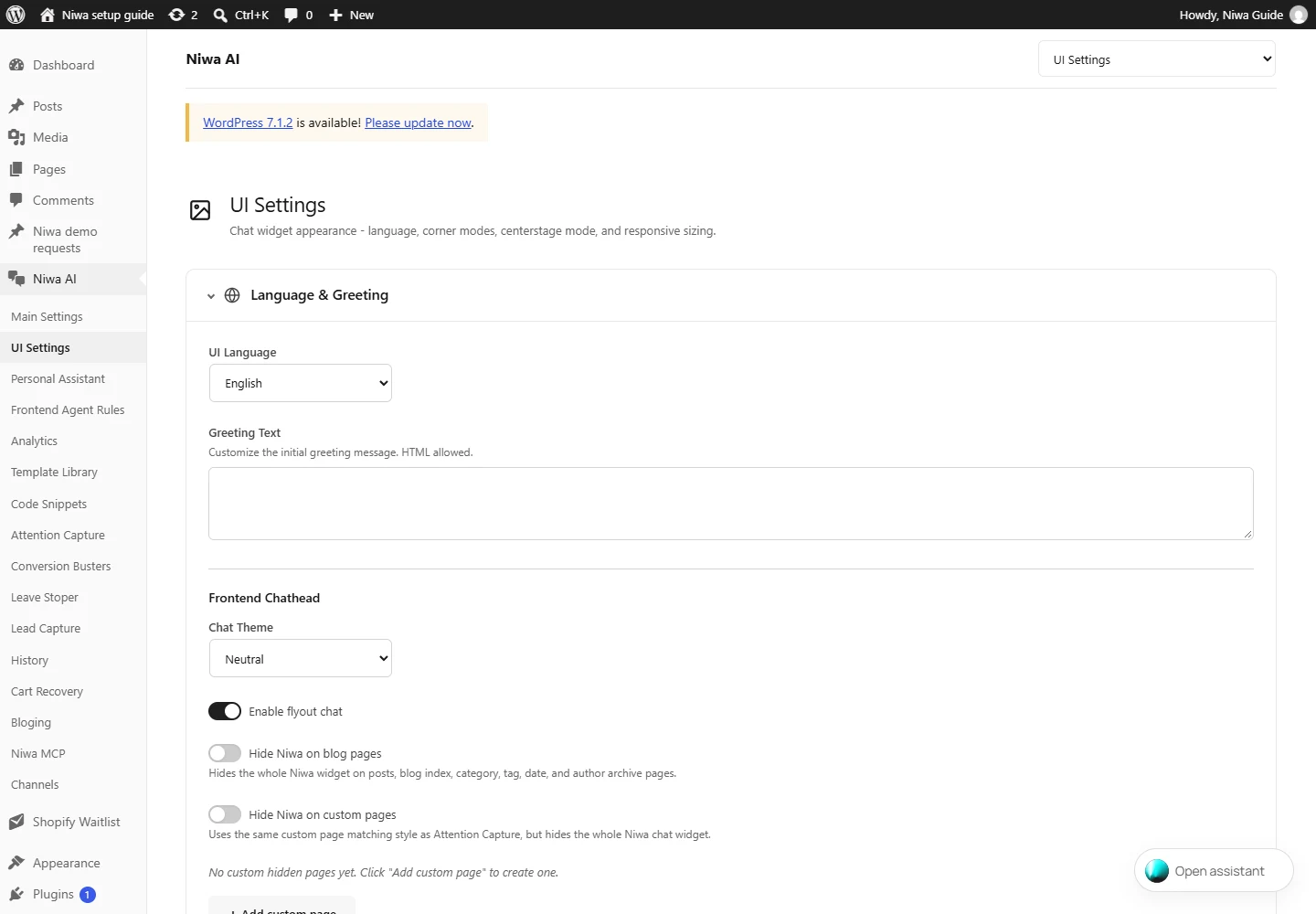
To customize an AI chatbot to match your website with Niwa, open UI Settings and adjust the greeting, chat theme, chathead image and launcher style. Set desktop, tablet and mobile positions separately, save the settings and check the public site. Match the opened conversation as well as the closed launcher, so customers can read and use it comfortably.
Begin with the website's existing colours, tone and page layout. A useful chat should look like part of the business and explain what it can help with. It should also leave navigation, product choices and checkout controls accessible.
Decide what the greeting should tell the visitor
In Niwa AI → UI Settings, review UI Language and Greeting Text. Write a short greeting that describes a relevant customer task, such as comparing products or finding service information.
For a furniture store, an example could be: "Ask me about dimensions, materials or delivery. If your question needs our team, I'll help you find the contact details." That tells visitors which questions they can ask.
Keep the greeting consistent with what you have configured. Mention the product, account or booking help you have enabled for customers. The Niwa setup handbook documents the greeting and language controls.
Choose the theme and assistant image
Select a Chat Theme and inspect it against your website. The Auto choice follows the visitor's system preference, so test both light and dark appearances if you use it.
Use Chathead Image to choose an appropriate image from your WordPress Media Library. A clear brand or assistant image is easier to recognise at small sizes than a detailed promotional graphic. Keep its meaning consistent with the greeting; do not imply a specific human is answering when that is not the service offered.
Check contrast in the opened chat as well as on the launcher. A pale brand colour may be useful as an accent but unsuitable for small text on a light background. W3C's contrast guidance specifies a minimum 4.5:1 ratio for ordinary text and 3:1 for qualifying large text, subject to the criterion's exceptions.
Select a launcher that fits the page
Under Launcher Style, choose the text pill or compact orb dot. The pill can explain the action with a short label; the dot takes less space but needs to remain easy to recognise as interactive.
Review Use Default Settings before entering custom pill text or text colour. The defaults use the built-in translated pill text and theme colours. A custom label needs its own language and mobile-width check.
If you choose the centered interface, review Centerstage Pill → Enable Centerstage Mode and its separate controls. Expanding that settings section does not itself enable the mode or save a change.
Use a label that names the action, such as "Ask about products." Avoid filling the small launcher with a slogan or a long list of benefits. Customers need to understand where it leads.
Position the launcher for each device
Open Desktop Positioning, Tablet Positioning and Mobile Positioning. Review the position, horizontal and vertical offsets, launcher size and expanded chat size for each group.
Check what already occupies that corner or edge of the page. A consent banner, sticky cart button or booking control can compete for the same space. Adjust the supported offsets and sizes, then inspect the result on the relevant viewport.
Review mobile fullscreen behaviour as well. Open the conversation, focus the message field and check that the keyboard does not make the input or close action unusable. Test a longer reply and a product card, not only an empty panel.
W3C's target-size guidance covers minimum pointer target sizing and its spacing and other exceptions. Use it when assessing small controls rather than shrinking every action to make the widget fit.
Decide where customer chat should appear
Check Hide Niwa on blog pages and Hide Niwa on custom pages. These settings hide the widget on the matching pages, so confirm the resulting visibility instead of treating a missing launcher as a colour or connection problem.
Keep chat available where its configured help is useful. A storefront assistant can help with product differences while a shopper is deciding. Page visibility should support that workflow without obstructing the page's main task.
For product cards, review the relevant UI Settings controls separately. Card presentation and purchasing behaviour should fit whether your site is a shop or a catalog. Do not change the appearance and assume the underlying product records were changed too.
Save and check the complete interface
Click Save UI Settings after changing the relevant controls. Clear the applicable site caches if the public view still shows an older design, then inspect the website in a private browser window.
Check the launcher, opened panel, text, images, links and close action on desktop and mobile. Try keyboard navigation and zoom, and review the languages you offer. Record any layout or control problem so you can adjust the relevant setting.
Appearance settings are separate from the AI account and business rules. If the chat looks correct but gives an inaccurate answer, inspect its source information and instructions. Niwa's safety guidance also explains why a public interface should remain separate from private administration.
For help fitting Niwa to an existing WordPress site, send your website URL and the device or page that needs attention. Include a screenshot of the layout issue with private information removed.