Why Does My AI-Built Website Look Generic?
An AI-built website looks generic when its brief, content, images and layout say little about the actual business. Diagnose the weak layer before regenerating.
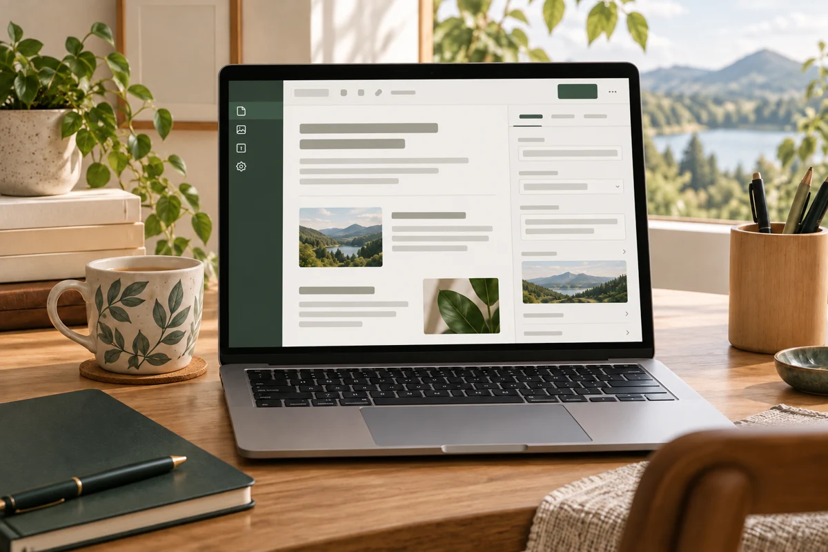
An AI-built website usually looks generic because the generator received broad instructions, little business information and no clear visual direction. Default layouts, interchangeable copy and unrelated stock images can then reinforce each other. Identify which layer feels wrong before asking AI to regenerate the entire website.
On WordPress, Niwa helps you replace vague content and make focused website edits through conversation. Start with one page and provide approved facts, useful photographs and a clear example of the change you want. Specific input gives you a result you can assess.
Identify what makes the page interchangeable
Open the homepage and one important service or product page. Cover the logo and business name. Would the remaining information still identify your business, location, customers or way of working? If it could belong to almost anyone, the problem may be the content rather than the colors.
Separate your observations into four areas: copy, images, layout and consistency. A page can use an ordinary layout yet communicate a distinctive service accurately. It can also have unusual animations while saying nothing useful. Write down the actual problem, such as "the first screen never says we repair commercial refrigeration" or "all service photos show offices, although our work happens in kitchens."
This distinction saves time. Rebuilding the navigation will not fix an invented service description, and adding more paragraphs will not repair conflicting typography.
Replace the broad prompt with a business brief
"Build a professional website" describes a mood. It leaves the generator to decide what the business does, whom it serves and how customers act. Give it information that should determine the page:
- The precise service or products and the customers who use them.
- Locations, exclusions and practical conditions customers need to know.
- The main task, such as requesting an estimate or choosing a product variant.
- Approved prices, policies and service details.
- Existing brand assets and examples of visual direction you can explain.
For a repair company, specify its equipment types, service area and enquiry process. Do not ask the generator to invent experience, qualifications or customer feedback. Business context is part of the creation approach described by Squarespace's AI builder, but the owner still needs to supply accurate information and review the output.
Keep references focused. Explain that you like a reference's clear service navigation or restrained use of color, rather than asking for a copy of another company's website.
Make the first screen explain the real offer
The first screen should help a visitor identify what you do and whether the page is relevant. A service name, useful location detail and clear next action usually contribute more than an abstract promise about innovation.
Compare two drafts for a fictional repair business. "Solutions for your everyday needs" gives the reader little to use. "Commercial refrigeration repairs in our listed service areas" identifies the service and makes the location boundary visible. Add the real areas only after the owner provides them.
Ask Niwa to update that specific WordPress section with approved wording and the intended enquiry link. Inspect the published page, including the button destination. If a heading is controlled by a theme template instead of the page body, identify the correct editing location before changing an unrelated field. The maintenance agent workflow is built around such concrete page tasks.
Choose images that explain your business
Use real product, premises or work photographs when the visitor needs to judge those things. An attractive stock photograph may establish a mood, but it cannot show the condition of your workshop or the product you actually sell.
Check each image against its job. A hero might show the principal service; a product gallery should reveal useful details; a process section might need a diagram. Remove images that imply a team, venue or customer project you do not have. Label conceptual illustrations honestly.
Crop for the actual layout. A relevant photograph can lose its useful subject on a phone if the composition puts it at the edge. Give meaningful images descriptions that identify what they show, without stuffing promotional phrases into alt text. W3C's initial accessibility checks include text alternatives as part of a usable page review.
Give the layout a clear hierarchy
Decide what a reader needs first, next and before taking action. Group related information instead of repeating identical feature cards for every subject. A service page might explain the task, eligibility, process and enquiry details. A product page may need selection, specifications, delivery and care information.
Keep heading levels meaningful. Choose a small set of type sizes, spacing values and colors, then apply it consistently. The aim is recognition and readability, rather than visual novelty in every section.
Wix's AI website builder describes generation followed by editing. Treat the generated arrangement as a starting point you can refine. If two sections do the same job, combine them. If a decorative effect makes the main action harder to find, remove it before adding another effect to compensate.
Change one representative page before the whole site
Save the current version and test changes on a private copy or through a reversible page edit. Choose a page that includes the patterns you will reuse: heading, image, body copy and action. Correct it, then check it at desktop and phone widths.
Ask another person to explain what the business offers after reading the page. If they identify the service but cannot find the next step, the hierarchy still needs work. If they describe an offer you do not provide, correct the wording.
Once the representative page works, apply its shared patterns to related pages. Avoid a sequence of site-wide regeneration requests, each introducing a new font or section style. For broader prevention, review the mistakes to avoid when building a website with AI.
Separate website identity from AI customer assistance
A website built with AI uses AI to create its design, text or code. An AI-powered website uses AI during business operations, such as answering customer questions. Adding a chatbot does not automatically make a generic design specific to your business.
Niwa can help an owner revise WordPress content, while the customer assistant uses the site's actual business information to answer visitors. Improve that information before relying on it in customer conversations. An accurate explanation of a repair service helps both the reader and the assistant; a fabricated claim harms both.
Send Niwa the page and the missing business details
Through Niwa's contact page, share the page address, the section that feels generic and the facts or images it should use. Existing WordPress owners can install the standalone Niwa plugin instead of rebuilding just to add the assistant.
Niwa Business costs USD 150 and includes a custom WordPress website or migration, hosting, maintenance and AI tools adapted to the business. Agree the work and billing period before ordering. A useful redesign starts with a page that says what your business actually does.